App Previews (video on the iOS App Store): thoughts and tips
Creative Assets
October 12, 2022
App promo video on the App Store.
It’s here.
It’s awesome for App Developers.
One can’t help but wonder why it’s only coming now when the Google Play Store and the Amazon App Store have added it a long time ago. But it doesn’t really matter: it is now fixed and completes the App Store Optimization puzzle.
After producing more than 1000 promo videos and game trailers since we started Apptamin, we do have some thoughts about the App Previews that were introduced. And a few tips as well.
posteVideo on the App Store: a great tool for app developers
If a picture is worth a thousand words…Video is the best thing next to actually trying your app…Show what’s magic and unique about your app in seconds… We’ve been talking for a while about the awesomeness of video, so I won’t get too much into it here.
The basic idea is that video lets you go beyond the screenshots to show what your app or game is all about: showing the UI, the gameplay. So you can get your point across. With an App Preview on the App Store, potential customers will now be able to quickly assess an app before downloading it.
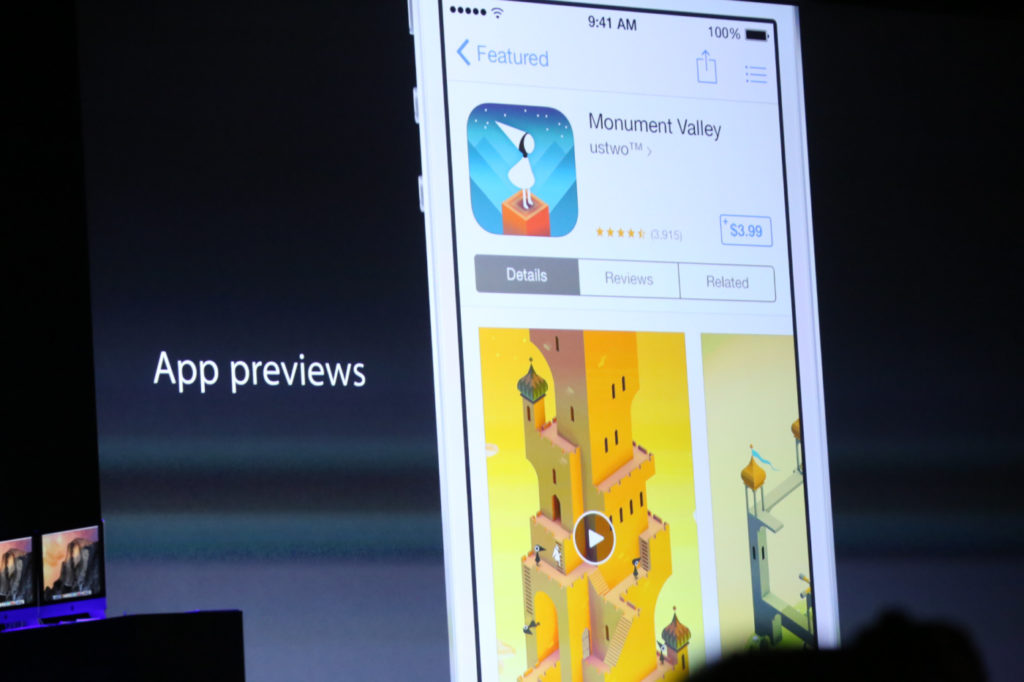
Right from the app details page. Which will lead to more educated, engaged users and therefore a better retention.
The basics: what an App Preview looks like and Apple advices
App Previews are quite different from Promo videos for Android apps, which are YouTube videos.
I’m not going to repeat everything that was said in the “Creating Great App Previews” session at WWDC14, so make sure you watch it. You might not have an hour to do it right now, so here are the timings where you can watch the App Preview examples (that will already teach you a lot):
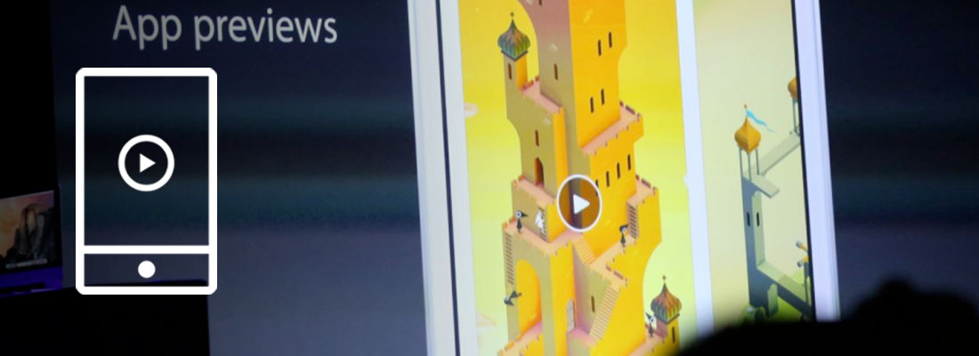
- Around 3:15 – Monument Valley (iPhone)
- Around 14:15 – Toca Boca (iPad)
- Around 18:50 – UpTo (iPhone)
- Around 26:05 – Leo’s Fortune (iPhone – landscape)
- Around 49:10 – Sky Guide (iPhone – landscape)
Here is what you need to know about the App Preview format (again, watch the video when you get a chance and here is a link to the current app preview documentation and the full technical specifications – search for App Previews on the page):
- Device specific (different app previews needed for iPhone and iPad apps)
- Up to 30 seconds
- Composed primarily of device-captured footage
- Shouldn’t look like an ad
- One localization (i.e only one language for one iTunes entry)
- Resolutions:
Pretty specific. So much that it comes with several limitations (more on that below). Still, you can do some pretty cool stuff to show what’s magic about your app and Apple gives you a few advices:
- Define the goal of your app preview beforehand
- Write an outline or a storyboard and think about the timing. The bullet points in your description can be a good starting point, as are the texts you placed on your screenshots
- Populate your app with data: make sure your App Preview captures show interesting and relevant data (and authorized), so your app doesn’t look empty. Choose the best levels for your game.
- Disclose all in-app purchases: add text to show what costs money if that’s the case
How do you create your app preview?
Well, that seems to still be up to you. But Apple decided to at least make it easy for developers by adding a way, with iOS 8 and OS X Yosemite, to capture real-time footage directly off your device.
- You connect your device to your Mac using the Lightning connector and capture with QuickTime Player.
- You edit your screen captures with the tool of your choice (not surprisingly, they recommend iMovie or Final Cut Pro X)
- Once you’re done, you submit via iTunes Connect like all the other elements of your app details page
Much much easier than it used to be!
Limitations of the App Previews
With new features usually come critics.
Apple introduced a lot of things at WWDC14 and many of them look great. But they often also come with limitations. And room for improvement.
Granted, we’re biased.
But here are our thoughts after more than 2 years producing promo videos for apps.
A screen capture can be limiting
The app preview for UpTo shown at the WWDC14 session was a one-take screen capture. In my opinion it was really hard to understand what was going on.
It was interesting because they populated their app with data, as they should, but when I wasn’t sure what I was supposed to take away or even to look at.
There’s no pointer/circle, so it’s hard to follow what’s going on in the screen when you don’t know where the touches are made. One could easily argue that their official video (the one on their website) gives a better indication of the app benefits than the app preview.
For a utility app, showing the magic and unique part in an app preview might not be that easy.
To stand out of the crowd and make sure app store users get what their app is all about, developers will want to go a step further than a one-take screen capture.
Luckily the guidelines don’t say “composed only of device-captured footage”, which means there are a couple of elements that could give life and meaning to your App Preview:
- Texts
- Voice over
- Highlights, so the eye focuses on a specific part of the screen (we’ll see if this is allowed – update Dec14: this seems OK)
- Logo animation (the Monument Valley and Leo’s Fortune examples given seem to have a logo animation at the end, although this could also be a screen capture)
- Touch indicator, to know where and when the taps occur (mostly for utility apps)
An App Preview is not enough to promote your app
Sometimes screen captures are not enough.
Videos using screen captures, even with motion design and animations, is not always enough to show clearly some interactions with the app.
It’s hard for an App Preview to beat a beautiful promo video or an exciting game trailer.
For some apps it can make more sense to show an interaction between 2 or more users so potential customers can understand both sides: in a buyer/seller scenario for example.
Some apps require an interaction with the user’s environment: taking a photo, interacting with a TV or another device (a speaker, a thermostat, a printer, etc.).
Some apps require specific gestures: handwriting apps, gesture-based apps (like Clear), games using the accelerometer. Take Blek for example. It’s hard to show the magic of their game without showing real-life interactions. It seems impossible for an app preview to compete with a trailer like the one they did (even though it’s fairly simple):
Even in their app details page screenshots they felt like they should picture a hand to explain the game.
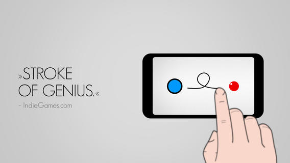
Don’t get me wrong: an App Preview, even with its limitation, is in most cases better than no App Preview (unless it sucks).
Developers need to get creative so that their App Preview converts as much as possible, and in most cases should strongly consider producing a promo video for their app as well.
App Previews are for iOS only, your app might not be
With this limited format, Apple pushes developers to create a short video only for the App Store.
It’s no surprise that they’ve defined their own rules. They’re right to do it, actually, if they don’t want the video thing to get out of control and hurting developers’ sales (and Apple’s bottom line).
But your app is also probably available (or will be) on Android. Maybe it’s on a bunch of different platforms/stores: Google Play, Amazon, Windows Phone, etc. If that’s the case, you can’t use just the limited App Preview video for your app promotion.
- You can’t use your App Preview on the Google Play Store (or other stores): it’s way too iOS-specific. Also, if your App Preview is made in portrait mode that means that on YouTube you’ll have two big black borders on each side of it (YouTube videos are in landscape 16:9 mode).
- If you want to promote your app on YouTube, or using Facebook video ads, you should do it with a video that really shows your app in its best light and with a clear call to action at the end (you’re not supposed to put badges or website addresses at the end of your App Preview).
- If you have a website or landing page for your app (and you should), you should have a more general video that shows what’s unique about it, on which devices it works and on which stores potential customers can download it.
An App Preview is device specific
App Previews are also device specific.
So you can’t really show in one video that your app is available for iPhone and iPad, and cool stuff like synchronisation between the two devices.
One of the neat things about iOS 8 and OS X Yosemite seems to be the concept of continuity. It therefore seems limiting to create one video for each device, when the trend seems to be that an app can be used across multiple devices (including a Mac sometimes).
Let say you reach out to bloggers and journalists, how many videos can you really expect them to watch? An app preview for your iPhone app, one for your iPad app, and a promo video for Android? And then you tell them “oh and there’s also a Mac app”.
It appears more efficient to me to also have a more general promotional video that helps understand the big picture.
“Technical” limitations
You have to pick either portrait or landscape for your app preview
That can make it hard to showcase your app: your app can be used mainly in portrait mode, yet some features might look better in landscape mode (let’s say a finance app that shows a graph when in landscape mode like Investing).
Not everyone has a Mac. Or one of the latest iOS devices for that matter.
Yes, if you’re the one developing the app you must have one but in a team (or in a company) that’s not always the case. Often, the person in charge of marketing and promoting the app is not the one who codes. Sometimes it’s not even the same company!
Our tips on App Previews
Enough about our thoughts on the limitations of the App Preview format. Developers have a new cool way of showing what’s unique about their app and they should make the most out of it.
Just like submitting the best screenshots to Apple for your app details page, having a killer icon, you want your App Preview to be the best possible.
App Previews are now part of App Store Optimization
You upload them with your binary, they are reviewed by Apple’s staff, and they end up on your app details page.
If we consider App Store Optimization in its broader sense (including description, icon, ratings, and of course screenshots), then we can now include App Previews in the ASO elements that affect downloads of your app on the App Store.
Also, what do you think curious iOS 8 users will start doing? Press that play button!
Follow Apple’s guidelines (and advices)
You want to make sure that you follow Apple’s guidelines and recommandations.
If they say your app preview should be composed primarily of device-captured footage, you have to respect that.
When they say that it shouldn’t look like an ad, you have to be careful about that too. That one is a bit more tricky, as your goal is to convert viewers to customers you need to get your point across and convince them.
As Apple approves or rejects app previews, everyone will get a better sense of the boundaries and best practices will emerge. The good news is you get feedback from Apple’s staff so you can try and experiment (Update Dec 14: it does take 24h each time though!).
Observe and experiment
Don’t just take a one-take screen capture for your app preview, even though Apple says it’s OK to do it.
Have a look at as many app previews as you can (starting by the ones presented at the WWDC14 session – update Dec14: and some of the app store promo videos we’ve produced) and think about creative ways to present your app within the guidelines.
You don’t have to stop at only one version neither, especially since it’s still hard to know what will be approved and more important what will work best for your app or game.
The same way you can test different screenshots over time, you can test different app previews (one after the other). Here are a few different things you can experiment on (heads up: you’ll only be able to change your App Preview when doing an app update, so you’re limited there):
- Features/Benefits: some features and benefits might be better shown with video, so focus on those. Like Apple said, focus on the “magic moment” of your app. Don’t try to show everything (you can’t in 30s) and consider creating alternative versions displaying different important aspects of your app.
- Length: hard to know right now if a 15s app preview will work better than a 30s app preview, even though Apple advices to make the most out of those 30s. Try and figure out what works best to showcase your app or game.
- Voice over: depending on the voice over script you choose, the app preview might sound too salesy and the video not approved by Apple. But maybe it will also have the right tone to convince the people you target, so give it a try.
- Text: you can add text to your app previews, which can be really helpful to help viewers understand what’s going on on the screen. Just like you do with your screenshots, you can try and change the text to see what works best. Text can either be displayed as an “interstitial text” (on its own screen) or over the UI (makes it harder). Either way, make sure it is SHORT.
- Music: music plays an important part in a video, as it definitely affects the tone. You need to find the right one for your app preview.
- Poster frames: this is how Apple calls the video thumbnail. Just like on YouTube of Facebook, you want to pick the best one possible: the one that will have more visitor playing the video. So far this poster frame needs to be a frame of the video, so that might affect the app preview production itself: you want to plan beforehand for which image you’ll use.
We reached out to 2 of our recent clients and played a bit with the new format.
Here are two versions we created for the Draft Kings app preview (one with voice over, one without) as well as two versions for the RetailMeNot app preview (same thing: one with voice over, one without). Please keep in mind that those app previews haven’t been submitted to Apple yet (-> we got some feedback since though, see update below). The format is new, and we’re experimenting.
A few thoughts on these videos:
- It’s possible that the first one sounds too much like an ad because of the voice over.
- We’ve added a nub/circle so that viewers know where the taps are. Update Dec 14: this is what Apple calls “touch hotspots”, and it is OK to use them when needed.
- The texts appear from the bottom or top, in a fashion that should make it clear it’s not part of the app.
- We’re not sure how much Apple will approve of the call to action on the last frame. Specially on the voice over version, where we kept the “free” part (in the WWDC14 session, they advised not to give price indications).
A few thoughts on these videos:
- Again, it’s possible that the first one sounds too much like an ad because of the voice over.
- We haven’t added a nub/circle so that viewers know where the taps are. It makes it more confusing.
- The texts appear in-between captured footage, so it’s clear it’s not part of the app. This should be allowed.
- Knowing that users may not get the same deal than the one showed at 0:11, we added a “deals offered may vary” text to let viewers know. Question is: is that too subtle? Does the text display long enough?
- The app icon and name of the app displayed at the beginning and end of the video might not be that useful: viewers are seeing this from the App Store, so they should know which app they’re looking at. In the examples Apple showed though, the logo was shown at least intro or outro.
UPDATE July 3rd: We received some feedback from Apple on the App Previews produced, and the key points were:
- It’s great to see App Previews come to life
- It is OK to have text interstitials, but there shouldn’t be too many and only when necessary. The ones before the notifications in the RetailMeNot example were judged non necessary. It is better to use that time in the video to show off more of the app’s content/UI.
- It is useless to show the app icon/logo at the beginning and the end: viewers will be on the app details page already and will see the icon and app name there. Logo can be useful if the company behind the name has a different name (that said, most of the examples given at WWDC at a logo/icon at the end so it is OK there).
- Text over the captured footage like in Draft Kings is OK (and required if content only available through in-app purchases) but it should be clear that the text is not part of the UI. Our contact thinks (and we see her point) that on the DraftKings example it is not clear enough (probably isn’t in the new version neither).
- It’s not sure yet if showing a nub/circle to show the taps to reduce confusion for the viewer will be allowed. It is suggested to file a request through Bug Reporter explaining why this is used.
- The voice over also on the verge of feeling sales-y should be OK because the quality of the audio is good. But they like it better when the VO is used for character narration and tells a story like it does on the Leo’s Fortune example
We took the feedback and edited the 2 App Previews:
See how the video thumbnails (“poster frames” on iTunes connect) on those examples are different? That’s something you’ll have to think about.
We’ll let you know when we have more information on what is allowed and what isn’t as we get feedback from clients and Apple.
Update Dec 14: if you want to check out RetailMeNot’s latest App Preview, head over to the App Store or watch the one below.
To sum up:
- App previews are pretty cool and you should take advantage of this new format to get more downloads
- The format introduced by Apple has some limitations, and an app preview is not the video you should use for all your app promotion needs (website, YouTube, ads, etc.)
- We still don’t know exactly what is OK and what is not. Time will tell, and we hope that there will be some flexibility so developers can get the most out of it (and users don’t watch boring screen captures).
Check out examples of App Store videos we produced.
Thoughts anyone? Feel free to also link to your app previews and let us know the reasons behind the choices you’ve made.
- Mobile Video Monthly #38 – November 2023 - 5 December 2023
- Disturbing ads, a new trend for mobile gaming creatives? - 28 November 2023
- The Power of Holiday Marketing in Boosting Mobile Game Engagement - 21 November 2023








Hello Sylvain,
so is it impossible create an app preview without a Mac?
It is possible: you can record your app’s screen using the device’s screen recorder then edit the video on your PC. However the device’s screen recorder shows a red “recording” bar at the top of the screen (for apps – not for full screen games)
Thanks Sylvain for this great article. Do you have any more recent update to share related to App previews?
Arnaud
Hi Arnaud,
Here are some recent articles on the topic:
https://www.apptamin.com/blog/videos-app-store-vs-play-store/
https://www.apptamin.com/blog/app-preview-play-store-videos/
Let me know if you have specific questions.
Best,
Sylvain
Great, thanks a lot Sylvain!
We still need to experiment with the app previews format.